


Faucheux Book Club
Please allow 10 working days to process before shipping
10 oz. Black Crewneck - Made in USA
50% cotton 50% polyester


Pierre Faucheux (1924-1999) lived and became a graphiste (long before the international usage of the english term designer) in the threshold between two worlds. World War II took the ground from beneath the traditional French graphic scene, and forced it to open itself to the American influence and to its new ways of creating and marketing something as old as books. At that moment of post-war tabula rasa, with a mix of normative rigor of the traditional typography and an intuitive drive, Faucheux, who had trained to be a typographer, was the right man at the right time in delivering the solutions to the demand of this new type of book. When book clubs were launched at the end of the 1940s (first the Club Français du Livre, then the Club des Libraires de France), his were the maquettes (layouts) for the more than 500 books that would eventually be published in the following years. Although he had assistants (one of whom would eventually become a master in his own right: Robert Massin), it was around Faucheux that all the decisions regarding the design and production of the books were centered, using many times untested new materials and technology: going personally to all the print shops that served the book clubs, he was truly the bearer of this new way of bookmaking during the 1950s. This and the following decade witness his peak, in which the pocketbook revolution also had his mark: his were many of the covers for the Livres de Poche (pocketbooks) collection, as was the layout for the Points collection for Seuil in the 1970s.

This is the man who broke the traditional scheme of opening pages in books by introducing rhythmic sequences of various consecutive spreads, in which type was allowed to show its visual beauty while preparing the coming of the text (as in the CFL edition of Les Chants de Maldoror, in 1949, one of Faucheux’s best known works); the man who used freely children’s doodles and overblown XIXth-century type for an edition of Tom Sawyer; the man to whom Raymond Queneau trusted the “typographical illustration” of the Exercices de Style. The norm in Faucheux, if we can use the form and content of his book as evidence, was boundless, almost game-like formal innovation over a rigorous blueprint made out of his twin passions: mathematical proportions and architecture.

Livre Objet
Pierre Faucheux is the single most important figure in French graphic design after Cassandre. His place could be challenged by others with reputations in single specializations–the poster designer Savignac, for instance–or by a few with a wider range such as Marcel Jacno or the Grapus collective. But Faucheux is unique in having created a genre. In the years following the Second World War, as an ‘architecte du livre’, Faucheux invented the ‘livre objet.’

Faucheux analyzed the elements of the book: what it is and how it works as visual communication. He looked not only at how the design and typography express the text, but at the overall structure–at the book as an object that is handled as well as read. The result was a series of pioneering works. Their energy and inventiveness, originating in the words, was directed to finding the visual acoustics in which their meaning could best be heard.
In 1946 a luxury fashion magazine, Signes, gave Faucheux the opportunity to work on a special issue with his hero Cassandre. In his posters Cassandre had used systems of geometrical divisions of the surface to determine the position of elements. Faucheux was fascinated by Le Corbusier’s tracé régulateur, a system for analyzing the harmony of building facades. By making a similar examination of renaissance books, as Tschichold had, he aimed to arrive at principles that could guide his work.

Writing about this, Faucheux suddenly challenges the reader. ‘A little mocking smile is coming to your lips, but you’re wrong, quite wrong! I’ve used this method for 30 years (why not admit it?) and it’s never let me down–even if I’ve taken liberties with it, which I often have!’ In France it was traditional to use geometry in this way, part of both Beaux-Arts and post-Cubist teaching. Faucheux is more original in his interest in the symbolism of typeforms. This is the focus of his contribution to design history: his work for the book clubs that began the next year.

Faucheux’s designs for the book clubs dealt with the “architecture” of the entire book, the relationship between its parts. The book club idea was based on the American Book of the Month Club. Unlike the Americans, however, each French book club publication was a new edition, edited and produced by the club. In France this strategy was particularly important after the war, when printing had been restricted and what was available for reading had to catch up with what had been written.

From his very first design for Mimes des courtisanes, a play translated from the Latin, Faucheux established his way of working. The size of Caslon type chosen for the text was very large, the names of the characters in spaced capitals. Compensation for the lack of typographic finesse (compare this with a Tschichold play text of the same period) is in the book’s visual energy, its lack of academic bookishness. It belongs to the twentieth century. The cover was a photographic detail of a black-ground Greek vase. This use of ‘symbolic iconography’ in place of illustration for the cover, endpapers and prelim pages was an essential part of the new style. Protected by a jacket of thin, clear, unprinted acetate, what appeared on the binding was particularly important in setting the tone. The apparent objectivity of the ‘document’ distanced the club’s books from the éditions de luxe illustrated by the masters of the Ecole de Paris. The image, as with the typeface, was not to be imposed on the text. The style allowed freedom in the choice of typeface for the titling, with often unexpected changes of scale; text was sometimes exaggeratedly generous in size due to Faucheux’s insistence on readability.
From 1946 for a period of nearly ten years, Faucheux was responsible for all the Club Français du Livre design. He made drawn layouts for the half-title, title, section titles, chapter headings, text area, chapter drop, running heads, folios, contents page and imprint. Plantin, Bodoni and Garamond were the favored typefaces for the text. Various nineteenth-century ‘Modern’ romans and grotesques played a special role.

If the typefaces were unsurprising, the books were not. Breaking the symmetry of the double-page spread had been sanctioned by the European avant-garde of the 1930s and Faucheux had no compunction in ranging type left, right and centered on the same page. In the United States designers well known in other fields of graphics were uninhibited by the high-culture status of the book–Alexey Brodovitch’s Ballet (1945) or Paul Rand’s design of novels for Knopf, for instance. The important American discussions of book design, Graphic Forms (1949) edited by Gyorgy Kepes, and Marshall Lee’s Books For Our Time (1951), ignored French publications. Yet Kepes in his introduction almost defines Faucheux’s productions. ‘A book can have an integrated personality–its outward face can correspond to its inner content’, he says. This is what Faucheux achieved in several hundred titles.

‘J’ai toujours agi par le symbole.’ (I have always worked with symbols). This is the key to Faucheux’s typography and use of images. The most celebrated of his early books is Henri Pichette’s surrealistic play Les Epiphanies. The text had been laid out in manuscript form by the author as a kind of concrete poetry and Faucheux used this as a layout, pasting up every line. Its originality consists in its substitution of symbols for words: odd typographic elements and bold letters found in the typecase replace the characters’ names. Pages are reversed, white type out of black. It is completely effective. Faucheux never repeated it, though he designed many other play texts. Each book was a new conception. ‘Toujours innover’ (Always break new ground) has been his motto.


The innovations would have been unusual in magazine design; in books they verged on the shocking. For the opening of Lautréamont’s Les Chants de Maldoror Faucheux spelt out Maldoror, each capital letter filling a page. The typeface was Deberny & Peignot’s Firmin Didot. This type design has a ‘serious’ expression, according to Faucheux’s essay ‘Letter construction’ (1952), a neglected text that is one of the most significant contributions by a designer to thinking about typographic design. In its historical reference it has some of the schoolmasterly tone of Tschichold, but the style carries the force of a manifesto.


Bold crossheads tell the reader that ‘An individual letter of the alphabet is a balanced composition’–an obvious enough statement vividly demonstrating that given just a few letters from any alphabet, one can deduce the design of the remainder because they are governed by long-standing laws. Even the most eccentric recent typefaces, from Emigre for instance, reinforce an idea which has never been presented as an axiom. Faucheux goes on to expound further principles: ‘a typeface design is a balanced composition.’ Another truism, but when Faucheux shows how a design can emphasize the individual letter at the expense of the whole word he is making a practical point. After this Faucheux comes to more subtle questions–crucial, and neglected, but with a direct connection to practice.

When Faucheux talks about always employing the symbol, he is saying that every graphic mark has a symbolic life. And this applies to typefaces. He thinks that the choice of typeface should be determined by the text: ‘Ways of establishing connections between the text and its graphic expression are so varied as to make it impossible to lay down absolute rules.

‘The range of different forms of printed matter, and the topics which it deals with, calls for an equally wide range of tone. The tone and the meaning of the graphics will be in direct relation to the reactions that will be provoked in the reader. It is a matter of striking a perfect balance between the text as words, and the meaning which the reader will give to the printed text: if different relationships governing the parts and the whole are brought together, we will make a new object for each new work.’

There was no standardization applied to the club’s books. In addition to the usual design decisions of choice of typeface and text area, Faucheux was able to determine the format. (He has a special preference for the squarish 205 x 165 mm). The book was a three-dimensional object, so the format was concerned not only with height and width but also with thickness and weight. In choosing paper, Faucheux took account of the way the paper bulked, not merely its surface and color. (The text pages of Mimes des courtisanes had been bluish-green, a paper used as ammunition wrapping).

Points
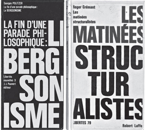
In 1962 Faucheux left the Club des Libraires, opening a studio, the Atelier Pierre Faucheux, which at its peak in the 1960s had 14 members, reduced to about half a dozen by the time it closed in 1993. The APF studio provided a design service to publishers. Between 1962 and 1976 it dealt with well over 400 separate jobs a year, some of them complete illustrated books. At this level of production there were fewer opportunities for originality. Among the more interesting results are the covers for the ‘Points’ paperbacks. The series was given a circular symbol. Within the circle a marking identifies each of the 19 subject categories–straight horizontal lines, straight vertical, curved horizontal, and so on.


Eye Magazine | Feature | Permanent innovation - Richard Hollis
Le livre de Poche
For Le Livre de poche, established in 1953 as a way for leading French publishers to make their books more widely available, Faucheux’s independent atelier (founded in 1963) dealt only with the books’ covers. These designs are part of the larger international story of the mass dissemination and promotion of low-cost, paper-covered editions to a growing audience of educated consumers in the post-war years.

The most impressive designs are fine examples of the interpretative skill, graphic invention, and compressed imaginative intensity that a good cover requires. “He loved to find ideas,” says Bernard de Fallois, a former director of Livre de poche, in Faucheux’s monograph. “His taste was both classical and full of fantasy. The research of reference material occupied a large place in his graphic constructions.” Before Faucheux took up the task, Livre de poche titles tended to have conventional painted covers by a usually unattributed artist. These earlier figurative illustrations are frequently charming, often kitsch, and now look very dated (good examples here). For all the books, the smaller “poche” size (110 x 165 mm) is undoubtedly part of their appeal.
As time passes, old paperbacks assume ever greater significance as graphic documents. Unlike most other forms of ephemeral graphic design, they have remained in everyday circulation; they are highly visible and easy to source, offering an immediate, object-based insight into earlier graphic styles and approaches. Contemporary posters, though still available to see at first hand, require more searching out from specialist sellers, and even 12-inch record sleeves are slowly becoming less available. All of the covers shown here were found in French used bookstores and markets, most of them this summer. I made a list of some comparatively rare titles, such as the complete works of Lautréamont, and usually located them quite quickly. Their condition obviously varies. They are also inexpensive: the typical price for a 1960s French design classic is one to three euros—slightly more in dollars.


The Atelier Pierre Faucheux’s prodigious output of book covers is listed at the back of his monograph. During the height of production, from 1964 to 1978, it averaged around 120 Livre de poche covers a year and this was usually less than half of the total output of book covers (the studio was also designing book interiors, exhibitions and other projects). In 1972, the atelier designed 219 Livre de poche covers and 419 covers in total. Naturally, this was a team effort; by the early 1970s, Faucheux employed 14 assistants. The credits on the back covers vary. Most of those I have seen say: “At. Pierre Faucheux.” Some say: “Faucheux art graphique.” The Anthologie de l’humour noir, one of Faucheux’s most inventive covers, based on his own collage, for Surrealism’s founder André Breton, an author he knew and admired, is simply signed: “Pierre Faucheux.” Some covers known to be by Faucheux, such as the Lautréamont, have no credit.

Faucheux’s main assistants—Bernard Flageul, Pascal Vercken, Daniel Le Prince and from 1975 Josseline Rivière—all acknowledge his strength of vision and control of most of what left the atelier. “The choice of images, the choice of type were 90 percent down to Pierre,” recalls Flageul, who joined the atelier at the start. “He explained things, made a sketch, which he signed and dated, and we executed it…He marked us all: we are all little Faucheux in some way.”

The books have no blurb on the back cover, though sometimes, as with Zola, all the titles in a series are listed for the reader’s convenience. In most cases, the atelier had the luxury of using both front and back for graphic imagery. This might be an extension of the front cover concept, as with Flaubert and Breton, a partial repetition or an inversion of the front (the Hugo simply flips the name and image, omitting the title), or an entirely new graphic idea and image, sometimes a document or a piece of writing in the author’s hand. Gerard de Nerval was revered by the Surrealists for his poetic interest in dreams and the back cover of his Poesies, an image of “La Main de Gloire” (Hand of Glory), is a particularly satisfying contrast. The book, decorated with a border of arcane symbols, has the dark air of a forbidden volume or an occult tract that promises strange knowledge and perverse illumination. Heady stuff for a small, inexpensive paperback.

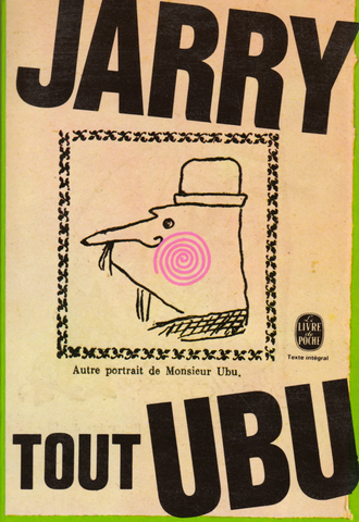
As the covers here indicate, Faucheux was entirely open-minded in his choice of letterforms and the designs are delightfully non-doctrinaire in their pursuit of styles of expression in keeping with the subject. Modernist sans serif is used only where it is effective; the intersecting, coldly monochromatic mirror faces of L’Astragale benefit from minimal distraction. An almost scientific yet eccentrically placed sans serif also works well with Faucheux’s surreal biomorphic blob for Apollinaire’s collection of short stories, L’Hérésiarque et Cie (1910). Elsewhere, Faucheux mutilates the Didot titlepiece used in his 1950 design for the book club edition of Les Chants de Maldoror, and contrives a jaunty, pre-punk typographic cut-up for Raymond Roussel, another talismanic figure for the Surrealists. Boris Vian’s bizarre 1953 L’Arrache-coeur (Heartsnatcher) receives a viciously torn alphabet, like a series of injuries inflicted on the cover, while a crime novel made into a film by Louis Malle is graphically summarized by a smeared, descending “ascenseur” (elevator).
Pierre Faucheux and Le Livre de Poche - Rick Poyner

The Facheux revival is firmly underway in France in the very expert hands of Catherine Guiral. She writes: Faucheux was one of the major figures in editorial design in France. Effectively renewing this particular field of graphic design, he practiced throughout the second half of the 20th century, leaving multiple traces which can be understood as experiments that revisit the ideas and techniques of the avant-garde. He coined a term–“general dynamic topology” (“topologie dynamique généralisée”) to describe this utopian territory. The use of such terms as “topology” or “territory” underlines to an extent to which space, in its multiple meanings, is inseparable from Faucheux’ work. After meeting Le Corbusier in 1947, his practice navigated between that of an inventive graphic designer and that of an architect “without title.”

The moves made by Faucheux–from his architectural practice as maître d’œuvre to his multiple works as graphic designer–seem to call, at first sight, for the Deleuzian notion of deterritorialization. A key concept as a working tool, the notion of deterritorialization is close to the idea of dépaysement, a term Faucheux used to describe his way of producing a “symbolic iconography” he multiplied for the many covers he designed.

The latter were witnesses to Pierre Faucheux’s will to constantly reinvent signs and forms within his field of expertise. In parallel, his work as an urbanist was concentrated on the modularity of space and the guiding idea that space could be specifically tailored for its users. Building the structures of books and writing the silhouette of spaces, Faucheux’s work is the image of a constant movement between being an “architect of the book” and a “writer of space.”
Catherine Guiral De Trenqualye | Royal College of Art

Ecrire l’Espace (whose title translates as “Writing space”), published more than 30 years after his first professional adventures, is an unclassifiable mixture of autobiography, handbook of normative precepts, essay on architecture, aesthetic rambling in a style between the coloquial and the soliloquial and portfolio, despite the limitations of the black-only printing. The freedom allowed by phototypesetting reigns in these pages, in some of which Faucheux seems almost wickedly determined to overturn the very same rules he had applied for two decades: articulated with images in permanent diagonal tension with the orthogonal grid, the text is flushed left and more than a continuous and fluid body, it is atomized in small paragraphs, discursive segments that phototypesetting allows to be taken out of the grid, cut out and pasted freely. A distant echo of his affinities with the Surrealists (having worked in 2 exhibitions in close collaboration with André Breton), this layout is also the perfect metaphor, within the boundaries of the book, of the designer’s working table, that arena where elements are organized and collide in tension before the final synthesis is achieved: here the layout is, at the same time, a windows to and a mirror of the process of typographic creation.

Faucheux’s style is also, like the book’s contents, somewhat erratic, but in the chapters strictly about editorial design he does achieve a completely objective and pure synthesis. The reader will not find here the deep levels of explanatory and theoretical rigor regarding the “good use” of type one finds in, say, Tschichold, but the confluence of masteries and the vital energy of Faucheux make this book an exciting (and quite rare) supplement to that more canonic and central stream of graphic design writing.
Écrire l’espace, de Pierre Faucheux | Montag : para retronautas
