


Joy of Learning
Please allow 10 working days to process before shipping
Khaki with Brown Stitch - Unstructured Hat
Buckled Closer - 100% Bio-washed Chino Twill

The cinema cannot show the truth, or reveal it, because the truth is not out there in the real world, waiting to be photographed. What the cinema can do is produce meanings and meanings can only be plotted, not in relation to some abstract yardstick or criterion of truth, but in relation to other meanings. This is why Godard’s objective of promoting a counter-cinema is the right objective. But he is mistaken if he thinks that such a counter-cinema can have an absolute existence. It can only exist in relation to the rest of cinema. Its function is to struggle against the fantasies, ideologies and aesthetic devices of one cinema with its antagonistic fantasies, ideologies and aesthetic devices.
Peter Wollen, “Godard and Counter Cinema: Vent d’Est,” Afterimage 4 (Autumn 1972): 6-17.
Godard’s films of the nineteen-sixties, starting with his first feature, “Breathless,” inspired young people to make movies in the same spirit in which others started a band. His works—political thrillers, musical comedies, romantic melodramas, science fiction, often more than one per year—moved at the speed of his thought, transformed familiar genres into intimate confessions, and made film form into a wild laboratory of aesthetic delight and sensory provocation. He put his own intellectual world into his movies with a collage-like profusion of quotes and allusions, and cast the people in his life as actors, as stars, or as icons. Working fast, he alluded to current events while they were still current. But it wasn’t just the news that made his films feel like the embodiment of their times—it was Godard’s insolence, his defiance, his derisive humor, his sense of freedom. More than any other filmmaker, he made viewers feel as if anything were possible in movies, and he made it their own urgent mission to find out for themselves. Where Hollywood seemed like a distant, cosseted, and disreputable dream, he made the firsthand cinema—the personal and independent film—an urgent and accessible ideal.

New powers of enunciation are central to Godard’s oeuvre. Television, in particular, represents for him new ways of seeing and hearing, new modalities of composition and decomposition (accelerating and slowing down the image), new strategies of mise en scène. Television, alias ‘video’ or the ‘electronic image’, signifies for him an unexplored potential for locating new sites in the image. Video is a whole way of being and thinking, as Philippe Dubois has argued (2) – a way of writing electronically with images and sounds about image and sound, of posing ethical, historical and theoretical questions about art, cinema, culture and society. Video represents a way of breathing through, and being intimately associated with, images – a means always within one’s reach.

Since Ici et ailleurs (1974), Godard has expanded his experimentation with the new electronic image and sound systems, in order to “redefine representation in terms of space, time, bodies, and speech”. Godard’s ‘border-crossing’ activity over the last twenty-five years has taken us into the forbidden zone between film and video – a new territory of imaginative possibilities and ‘in-between’ forms, gestures and spaces. This is the attempt, as Godard once put it, “to see not this or that, but only to see if there is something to see.”
Godard’s presentation of the act of seeing and hearing his own work as it takes shape before him typifies an oblique image-writing, reflecting the wisdom of Montaigne’s words: “The world is but a perennial movement. All things in it are in constant motion, I cannot keep my subject still, I do not portray being, I portray passing.” This is evident, for instance, in Scénario du film Passion, where Godard suggests that images are meant to render the invisible visible. Godard’s stirring studio discussion, taking place in front of his large TV screen (the “white beach”), comprises a grand search for the function and reality of today’s images, predicated on the dictum “voir-recevoir” (see-receive). Referring to Scénario, Jean-Louis Leutrat persuasively argues how for Godard, in a fleeting and engimatic moment, “the relationship between the image to be made and the image already made” contains the trace which belongs to the past. It is a prefigurative fragment. What makes the history of cinema possible, Godard maintains, is that there remain images which embody its traces, and these traces mysteriously resemble us. Godard is thus an author who needs to create cinema and video as a continuous dialogue, a theatre of memory, infusing the image with language and quotations.

Video collage (particularly in reference to its organic and ‘musical’ aspects) offers the opportunity for writing electronically – composing and decomposing images and sounds in a ‘live’ way. Godard’s use of collage is structured around his obsession to harness the image to language and, according to Raymond Bellour, this has four different modalities. From Godard’s shorts in the ’50s to his current videotapes, we encounter the ubiquitous presence of books heralding a concern to make art which is indebted more to language and writing than to music and painting. The second modality is quotation, issuing from characters and books like fragmentary traces pregnant with meaning, veiling and unveiling the image. The third modality consists of privileging text over image: ads, signs and graffiti are often foregrounded in his works like Cubist collage elements. Lastly, there are the voices of the characters and quotations, as well as Godard’s own voice addressing his viewers.
Godard had “a unique ability to alight on an object and, through framing, dramatize its material existence and plasticity,” writes James S. Williams. “The multiple textures and ellipses of his work achieved with his regular editor, Agnès Guillemot, produced sudden flashes of often breathtaking simplicity and grace, and his ingenious use of signs, texts, and photomontages illustrated his exceptional skills as a graphic artist.”
Only the Cinema
The Reinventions of Jean-Luc Godard | Current | The Criterion Collection
Jean-Luc Godard Was Cinema’s North Star | The New Yorker

Godard: Images, Sounds, Politics
The author, Colin MacCabe, an admirer of John Berger’s Ways of Seeing, asked Richard Hollis to design the book. MacCabe invited him to watch all the Godard films at the BFI, and supplied the text in parts for typesetting (by photocomposition). The edited typesetting was then pasted up page by page and the width of the column varied to accommodate film stills precisely where the text demanded them. This required slicing typesetting between lines and reconstructing them by hand to a narrower measure, Footnotes were simultaneously incorporated.
On the basis of seeing the Berger work, fiery Cambridge academic Colin MacCabe approached Hollis to design this structuralist analysis of Jean-Luc Godard. The book was initially developed by the author and designer watching the films together (Hollis’s knowledge of French was a huge advantage). Throughout the book, sequences of stills from these sittings punctuate the text, set in a justified column which contracts and expands to accommodate them. Footage is used grammatically, with repetition, jump-cuts and obscure juxtapositions that echo Godard’s own wild inventiveness. Such graphic logic is also worked out typographically: the voices of Godard and his characters always appear in bold to MacCabe’s roman, for example, and the author’s occasional notes are stuffed into gaps between columns, as if scrawled directly onto the page. The book was typeset as soon as MacCabe produced his text, chapter by chapter. Hollis pasted up the type with screened bromide prints of the images, in some instances line by line.

The main body of analysis is sandwiched by an opening title sequence that juxtaposes quotations and contemporary film images (bringing the reader up to date with the myth of the then-reclusive Godard), and a closing title sequence that reproduces a section of one of Godard’s collaged pictorial storyboard-scripts. Other screen conventions were appropriated. American Typewriter, the standard subtitling font at the time, was used on the cover, for page numbers and chapter titles – reversed white out of black in TV-format boxes.

The book was photoset in Times on a Compugraphic system chapter by chapter as it was written and these ‘rushes’ were pasted up by Hollis himself into a grid determined by the ratio of the film image. The text measure contracts to form a central gutter for film sequences at the point where they are discussed and notes are starred and inset for ease of reference. To further aid accessibility, film titles and quotations are highlighted in bold. The fluid, filmic quality of the book is carried through in the use of American Typewriter bold condense to suggest slightly blurred subtitles and in the placement of chapter headings in a screen-like panel.
The series of Hollis’ work reflects a mutual trust between designer and authors/editors. This trail of work developed because the commissioning parties in each case had recognized Hollis’s previous work and interest. In each case a relationship was established on the basis of his approach. Because of this implicit understanding, the shared wavelength, the final product ends up greater than the sum of its constituent contributors. An intense working relationship results from a joint search for the best means of communicating ideas, through familiarity with the subject matter and the author’s relation to it. Rather than the books being editor- or designer-led, they push for a third, uncharted way. Other examples that come to mind are the various collaborations between Marshall McLuhan & Quentin Fiore, and recently Rem Koolhaas & Bruce Mau, in which form and content end up similarly symbiotic. As such, they demonstrate a sort of truth-is-stranger-than-fiction aesthetic. An open mind and a willingness to draw form from content, dismissing convention and personal stylistic agendas, results in work more visually radical than a purely formalistic approach where radicality itself is the main aim. In an article on Hollis called ‘The New Tradition’, Robin Kinross pinpointed this, describing his subject as ‘inventive rather than innovative’. These books feel rather than look the same precisely because they share an approach rather than a style.

It’s almost too obvious to point out that these books preempted digital multimedia, being collections of disparate material combined to articulate a story or argument. The then-infant influence of TV is all-pervasive, most obviously in the quick-cut documentary-style editing that results in their unusually animated narratives. With the exception of one, the books are fundamentally about film in one form or another, so Hollis’s appropriation of the medium’s techniques is especially apt, working under the influence of a few similarly cinematic works such as French documentarian Chris Marker’s Commentaires. The books also flag up certain process similarities across media, like real ink-on-ink over-printing, jump-cuts in film, or a band ending a song at the same moment – all of which seem fundamentally connected in the same way that ‘opposite’ techniques like fake overprinting, graduated tints, or fade-outs in film and music are. Again these former qualities seem to describe (and this sounds a lot better in my head than it does on paper) an aesthetic of truth.

Tellingly, these books were made between the late 1960s and early 1980s, when layouts were typically made by cutting blocks of text from one long typeset ‘galley’. The two Berger books were made by drawing approximations of the pictures, with proofs of the texts stuck down onto same-size flat layout sheets. The pages were later reconstructed from these instructions by the printer, a process that involved a certain amount of juggling and guess-work. In contrast, while the later Godard and Jennings books were also constructed on double-page templates, the typesetting and images were always final ‘camera-ready’ versions. This paste-up was eventually photographed to make film from which printing plates were made. There- fore, this process was much more precise. Resizing images or changing type characteristics were prohibitively expensive, so decisions had to be fixed at an early stage, which explains some odd features. In the Godard book, for instance, paragraphs intended to carry images were made thinner before knowing the exact number of stills to be used, creating erratic gaps.
Compared with current page make-up software and production techniques, paste-up is a fundamentally different way of working that affects the outcome in a number of ways: 1. Focus. The nature of paste-up means that decisions must be made sooner (and stuck with) unlike DTP, where work can be – and so always is – changed up until the last minute; 2. Tactility. Paste-up is physical. The production process involves three-dimensional ink on paper rather than two-dimensional light on screen, so the designer is always work- ing closer to the reality of the final object; and 3. Pace. Paste-up occurs at a slower, more human rate. Although having long since acquired an Apple Mac, it’s notable that Hollis still uses his old wax glue machine. Wax is funda- mentally different from spray glue because it can be repeatedly removed and re-stuck, allowing the work to stay open-minded and breathe.
Stuart Bailey - Ways of Working

Le gai savoir (Joy of Learning), 1969
An image of what looks like pastel puzzle pieces with a pair of eyes peering out of them. “I mage” written on it, a separation between I and mage. Godard knows that images are magic. Language too can be cracked open, returned to zero. The educational tools reference Jean-Jacques Rousseau's "Émile," which is supposed to be an educational treatise in novel form. In these stunning collages incorporating text, book covers, and pop media and in some of dialogue between the main characters, Godard manages that near-impossible feat: He is brazenly didactic, and yet turns this didacticism into an art and a thing of beauty.

Framing Godard
Like many other movies, the films made by Godard since the mid-1970s show up at the projection booth without hard matteing. So at what ratio do we show them?
James Quandt was mounting one of his typically ambitious retrospectives, this time on JLG, and so his essay, “Here and Elsewhere: Projecting Godard,” posed a question that had long been ignored.
James found that several films, including Passion, Je vous salue Marie(Hail Mary), Nouvelle Vague, Hélas pour moi, and For Ever Mozart, looked “abjectly constricted” in 1.85. So James wrote the man himself.

“Disturbed by some oddly cropped compositions in Éloge de l’amour, which result in seemingly unintentional beheadings and concretions, I consulted Godard by fax about the aspect ratio and he confirmed that it was indeed, as stated, 1.66 (rather old-fashioned in its own way). That he occasionally still seems to be jamming a 1.33 composition into a frame that cannot accommodate it suggests his instinctual preference for the open image.”
Soon after James and I had our exchange, Godard—perhaps prodded by James’ query—sent a diagram to Cahiers du cinéma. The Cahiers editors report that Godard has asked that Notre musique be shown in 1.37. His photomontage lines up two shots from the film and arranges them according to the three major “flat” ratios, and for each one he supplies a tart annotation.
For the close-up of the woman, the captions translate as: 1.37 person. 1.66 character. 1.85 satellite slave. For the long shot of the street, we get: 1.37 Proof of Serbian bombing. 1.66 Proof diminished by Europe/ USA. 1.85 Extermination of proof (Milosovec acquitted).
Even if you’re not that interested in Godard, everybody should be aware of what video cropping can do to the film image. I’m not talking about panning and scanning, that process which begins with a widescreen film, typically one of an aspect ratio 1:2.40, and extracts a 1.37 frame out of it for video purposes. This is deplorable, but most of us are alert to it. What’s more interesting is the sort of thing that happened when a film is cropped inaccurately, either in projection or for DVD.

I’m always amazed that critics can praise a Godard film without ever getting down to explicating what’s literally happening in a scene. They write as if these films were telling their stories straightforwardly. Without help from the presskits, could journalists discern even the sketchy plots they refer to? A great deal of the fascination of Godard’s late works comes from his refusal of the most elementary forms of exposition–picking out characters, explaining their relations, and the like. There is always a story, but it’s about three-quarters hidden, and this seems to me to require a lot more analysis than people tend to give it.
Heads are trimmed in movies all the time, and it doesn’t much matter in close views. But in Éloge, Godard is composing long shots with heads quite high up. He will even daringly chop off heads himself. This is partly a strategy to conceal who is present, to block our recognizing characters by their faces. It also has the effect of activating areas of the frame that aren’t usually so important. We have to strain to see partially visible things, tucked away in bits of the shot.
Overambitious cropping changes the compositional dynamics. In reducing information, it reorganizes the composition. Rudolf Arnheim suggested that we consider a picture as a field of vectors and forces, pushes and pulls, balance and imbalance, rival centers of attention. By changing the framing we change the relation of the figures to the edges, and this can alter the composition.
It’s worth noting that Godard himself is a mean hand at radical cropping. I’ll forebear from rambling on about what his original framing above does to the original, Manet’s Seine at Argenteuil (1874), but it could constitute a lesson in how framing changes effect and meaning.

Many of these differences wouldn’t matter in most films, which aren’t composed as meticulously or as daringly. Hollywood images aren’t typically as dense as those in late Godard. (I must do a blog some day on fussbudget filmmakers like him.) But even if these niceties seem negligible, I think you’ll grant that the film would be much more compromised by being shown in a 1.85 ratio, the squarest option available in most commercial theatres today.
Critical discussions of Godard’s late films have treated them as poetic meditations, and that seems partly right to me. Yet few critics ask how they manage to create their lyrical, associative quality. I think, as I hope to show in a future blog, this has to do with his treatment of narrative (naturally) and his layout of scenes. But even before we get there, I think that we find in the very texture of his images (let alone his sounds) a daring decentering of faces and bodies—the usual nodes of our attention. If he often blocks the flow of our glance, it’s in order to rechannel it to unexpected areas and textures, crannies and gaps, within the image. And so we want all those areas and textures, along with the crannies and gaps, available to our eyes and minds.

Godard comes in many shapes and sizes, David Bordwell
Godard's Intertitles
Jean-Luc Godard, arguably the most radical of the Nouvelle Vague filmmakers, is an artist whose imaginative typographic title sequences, intertitles, still and animated imagery inspires me as a designer. Posted here, are stills selected from four of his films from the mid- to late 1960s.

Godard inserts text and image into a variety of contexts, including, but not limited to: handwritten letters, neon signs, shop signage, book and magazine covers, collages, grafitti, posters, cinema marquees, corporate logos, the pages of comic books, advertisements, newspapers, children’s books and political pamphlets. Pierrot le fou (above) is rich with contextualized text. Its narrative is reinforced by the images of handwritten letters between protagonists, signs from the places they travel, and a book called, “La bande des pied nickelés,” a cartoon about a group of ne’re-do-wells who make their living scamming the bourgeois. Cropped and blinking neon signs highlight specific words, or segments thereof (e.g. “Riviera” becomes “vie), a mercurial device well-suited to Pierrot le fou. Overall, the embedded texts add meaning and beauty to the film, with patterns of live action and still text reminiscent of a graphic novel. There are few purely typographic titles in this film, but all have dotted upper case “I”s and capital letters centered on black backgrounds—the default Godardian style—set in Antique Olive, a face newly developed in the early ’60s by Fonderie Olive.
In Masculin féminin, Godard begins to use purely typographic intertitles, a break from earlier films’ embedded texts (e.g. the book cover argument between lovers in Une femme est une femme, 1961), or alternating texts and titles (e.g. Les Carabiniers, 1963 and Alphaville, une étrange aventure de Lemmy Caution, 1965). Devoid of imagery, these intertitles look like “title cards” from the silent film era. Unlike silent film titles—which provide dialog and narration—the content both reflects the thoughts of the protagonists and comments on the culture-at-large, addressing film, politics, and commercialism. Like previous films, Godard continues to play with language. Letters drop in and out to reveal new words, as in the the closing title, when “Féminin” becomes “Fin.” Formally, the titles are consistent: dotted upper case “I”s and centered justified text on black backgrounds, likely set in a custom version of Futura with a shortened “M” centre vertex. The film, shot in flat black and white, manages beautifully with white text.
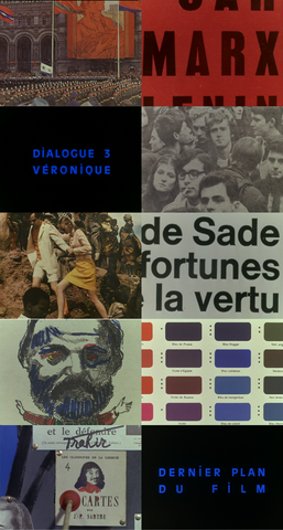
Though stylistically more similar to Pierrot le fou than to Masculin féminin, the intertitles in La Chinoise continue Godard’s move toward the politicized texts he continues to use into the ’70s and ’80s. His presentation of images and titles reads like a manifesto, eerily predicting the political unrest of May 1968. The inclusion of embedded texts (e.g. color swatches, pages from comic books and political publications) reduces the contrast between mise en scène and intertitle. The contrast is also blurred as texts are altered, presumably by narrator or protagonist: 1) colored markers decorate a Karl Marx caricature, 2) suction cup arrows attack a collage of French thinkers and revolutionaries, and 3) “défendre” is crossed-out in favor of trahir. Large, cropped portions of books and newspapers highlight specific words, and function both as embedded text and typographic intertitle.

In Le Weekend, Godard returns to the purely typographic titles last seen in Masculin féminin. He inserts line breaks, shifts color, repeats titles and uses graphic elements (e.g. the crossed-out “Front de Libération de Seine at Oise”) to play with words, numbers, and their meanings. “Analyse,” broken into two lines, serves as the chapter title for an explicit pseudo-psychoanalytic scene in the beginning of the film. “Photographie” is cleverly renamed “Fauxtographie,” and is made more striking by strictly justifying the text letter-for-letter, achievable with an H/I hybrid letterform. There is even a speedometer, tracking the protagonists’ km/h throughout the film. Blue, white and red text is a common Godardian palette, usually referring to American cultural hegemony and aggression, in addition to rising tide of nationalism in France. In this film, the color scheme may also refer to the titles’ gradual shift from Gregorian calendar dates to French Revolution events. Formally, the colors highlight specific characters or words, and contrast nicely with the black backgrounds and the warm, sunny style of the live-action sequences. The mostly-justified, all-cap titles are again set in Antique Olive.
Godard’s style developed from various influences in his life and career: 1) He came from a well-to-do Franco-Swiss family where poetry and philosophical texts were regularly recited. The reading and recitation of text is a common thread in his films, often represented typographically. 2) Godard has a reverence for, and an encyclopedic knowledge of film, including the works of F.W. Murnau, Jean Cocteau, and Alfred Hitchcock, all known for the style of their embedded text and imagery. Murnau, as a silent film director, used intertitles as they were first intended—to deliver dialog and narration—though he experimented with contextualization, using pages from old books and letters between characters. Cocteau, inserted his own untranslated handwriting intoThe Blood of a Poet. The film is not silent, and the writing is not necessary, though it adds texture and meaning to his work. Godard uses intertitles the same way, as vehicles for content and style not always immediately relevant to his narrative. Hitchcock, began his film career as a writer of intertitles. As a director he embedded texts into everyday cultural displays such as street signs, posters, bilboards and newspapers, a practice Godard repeats in films like Le Mépris, 1963, and Une femme mariée, 1964. 3) Godard was a film critic and a contributor to Cahiers du cinéma. Via intertitles and embedded texts, he continues to write, peppering his films with homages, critiques and references.
Andrea Hyde, The Gradient, 2009
