


Las Vegas Duck
Please allow 3 working days to process before shipping
Garment Dyed - Vintage Black Long Sleeve
Made in USA - 100% USA Cotton

“Form follows fantasy not function, for architecture that cannot offer fantasy fails man's needed dream.” - James Wines, “Duck Design Theory”

“Learning from the existing landscape,” Venturi, Scott Brown, and Izenour begin in their 1972 classic Learning from Las Vegas, “is a way of being revolutionary for an architect.” Perhaps more than anything else, the research methods pioneered in Learning from Las Vegas have changed the way architects practice and study, recasting quotidian landscapes as objects to be analyzed rather than ignored or denigrated. “Withholding judgement may be used as a tool to make later judgements more sensitive,” they write. “This is a way of learning from everything.”

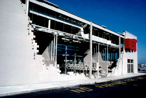
All cities communicate messages–functional, symbolic, and persuasive–to people as they move about. Las Vegas signs hit you at the California border and before you land at the airport. Venturi and Scott Brown created a taxonomy for the forms, signs, and symbols they encountered. The two were inspired by the emphasis on sign and symbol they found on the Las Vegas strip. The result was a critique of Modern architecture, demonstrated most famously in the comparison between the "duck" and "decorated shed." The "duck" represents a large part of modernist architecture, which was expressive in form and volume.

Learning from Las Vegas created a healthy controversy on its appearance in 1972, calling for architects to be more receptive to the tastes and values of "common" people and less immodest in their erections of "heroic," self-aggrandizing monuments.
Mimetic Architecture
The history of “duck” architecture can be traced back to the World’s Fairs in major American cities in the 19th century. In particular the San Francisco Exposition of 1915, in which the Beaux Arts architectural environment was a polychrome version of Chicago's "White City."

San Francisco was a turning point because for the first time at an Exposition, the fair's administrators and designers turned their attention to Midway design, the end strip of the Exposition where concessions were sold. Not only were the professional services of Exposition designers offered to Midway concessionaires, but the Exposition management announced the requirement that all concessions were to be self-identifying without the aid of billboards or signs.

As a result of the sanction against signing, the Midway at the San Francisco Exposition became a zone of out of scale "signature architecture." Each attraction became an advertisement of itself either in its three-dimensional form or by means of visual cues–"facade architecture"–attached to the front of the structure. A gigantic Golden Buddha announced the presence of a Japanese concession. "Tin soldiers," approximately ninety feet tall, housed merchandise booths in their feet. The Atchison, Topeka and Santa Fe Railway constructed a scale model of the Grand Canyon. Amusements and displays, as advertisements of themselves, depended on their architectural merchandising for continued commercial success.

In California, and especially in southern California, the transition from the Midway to urban commercial street was relatively simple. The stucco construction methods employed to produce ephemeral structures for the expositions were particularly suited to southern California's mild climate. The addition of cement to the stucco mixture–a technological breakthrough which occurred in time for the San Diego and San Francisco Expositions and which enabled the stucco to carry pigment–was the essential ingredient for stabilizing this previously unreliable building material.

Nonetheless, Midway-style architecture was not unique to southern California. A poultry store on Long Island established itself in The Big Duck; a dairy stand in Boston could be found in a gigantic milk bottle; a Cincinnati snack shop was built into a giant sandwich flanked by monumental salt and pepper shakers; a Texas gas station was built in the shape of an oil derrick, and one in North Carolina was built as a sea shell; in Iowa, a giant coffee pot housed a diner, and in New Orleans a nightclub named Crash Landing was partially constructed from the front end of a Lockheed Constellation (complete with wings). These, and countless examples which have escaped documentation, bore witness to the nationwide exploitation of Midway "signature architecture" in which form often quite literally followed function.

To architectural critics in the 1920s, this encroachment of commerce upon the suburban residential fringes became synonymous with social pathology. Displeasing architectural design seemed to represent an environmental threat equivalent to garbage dumps.

Venturi and Scott Brown’s ‘Duck’ is plucked from this high-nosed criticism. Peter Blake's book God's Own Junkyard (1974) is an homage in reverse to the worst of what Blake could find in the 'honky-tonk, crassness, phoniness' of the typical American commercial strip. Blake's prize example was a poultry-stand on Long Island, New York, which was shaped to look like a duck. One could thus 'read' its function—selling poultry—from the duck-like form of the building itself.

D.D.T.
In his slightly facetious article, “The Case for the Big Duck,” published in Architectural Forum in 1972, James Wines argued that there was an important difference between modernist functionalism and the amusing literalism of the Big Duck; the Big Duck challenged the most basic principle of the formalist aesthetic: that it should function self-referentially as pure connotation. Furthermore, the unexpectedness of the Big Duck introduced play and fantasy into the everyday urban experience, subverting the utilitarian “business-as-usual” aesthetic of expediency promoted by most American architecture: “The difference between Form-follows-function and the Duck Design Theory might be compared to the choice between sex exclusively for procreation or sex for enjoyment. Both can produce the same results; but only the latter makes life worth living.”

The Tamale - Los Angeles, California. 1928
If you’re in the mood for a tamale, why would you go anywhere but a restaurant shaped like a tamale? The Tamale opened at 6421 Whittier Blvd in East Los Angeles in 1928, where they offered not just tamales and tamale pie, but hamburgers, chili, and something called Spanish Delight (which I had to look up and found it’s a type of casserole.) In the style of the time, the tamales were often served unwrapped and with chile con carne spooned over the top as a sauce. This “hot tamale” style is still a popular favorite with some old-school Angelenos to this day. You could wash it all down with malted milk (“As you like ’em”) and for dessert a 5-cent ice cream cone.

The Whale Car Wash - Oklahoma City, Oklahoma, 1970
Built on the corner of Northwest 50th Street and North Meridian Avenue, Oklahoma City, Oklahoma around 1970. Not much is known about the eye caching structure, and today it has been torn down, so any information would be more than welcome.

So, this is one of those things I completely forgot about until I saw John Margolies’ photo. Then, a flood of memories came back. When I was a tiny tot, I was completely mesmerized by this sweet whale and begged my dad to drive by my buddy periodically so I could say hello. It was located near the intersection of NW 50th and Meridian, according to Margolies’ caption, but I can’t remember exactly where. Do any of you remember?
The Big Duck - Flanders, New York, 1931
The Big Duck in Flanders, NY, was originally built in 1931 by duck farmer Martin Maurer in nearby Riverhead, and was designed in the shape of a Pekin duck in order to house a shop to sell ducks and duck eggs. The building measures 18 feet wide, 30 feet long and 20 feet tall to the top of the head. The duck's eyes are made from Ford Model T tail lights.

Hat n’ Boots - Seattle, Washington, 1954
Touted as the largest cowboy hat and boots in America, these pieces of massive rancher apparel made their debut in the 1950s in Seattle’s Georgetown neighborhood as part of a western-themed gas station called Hat n’ Boots. The 44-foot-wide hat was designed to hold the gas station’s office while the 22-foot-tall boots served as the restrooms.The boots were a particular source of pride for their designer, artist Lewis Nasmyth. He personally bent and creased the boots' steel mesh before the concrete was poured over it, so the boots would look worn and wrinkled.

To preserve the landmark, Kai Schwartz, a Seattle architect who lives a few blocks from the Hat n’ Boots, led a march in Georgetown in March 1997 by demonstrators all wearing cowboy boots and attire to protest the Hat ‘n’ Boots demolition. In 2003, the City of Seattle moved the Hat 'n' Boots to the new Oxbow Park. The Hat is now a park shelter. Kids like to sit on the toes of the Boots. Lewis Nasmyth, who still had samples of the Hat n' Boots' original colors, supervised their repainting.
Haines Shoe House - Hellam, Pennsylvania, 1949
Successful shoe salesman Mahlon Haines (he called himself the ‘Shoe Wizard’) knew the value of self-promotion. The story goes that Mahlon took a work boot from one of his stores, handed it to architect Frederick Rempp, and said, "Build me a house like this."

Built between 1948 and 1949, the stucco-covered timber-frame building with stained glass windows reaches a height of 25 ft. The toe contains a living room, while the heel contains the kitchen. Two bedrooms are in the ankle, and an ice cream shop was located in the in-step.

The Big Fish - Bena, Minnesota, 1957
For a roadside icon, The Big Fish Supper Club has a history as murky as the bottom of some Minnesota lakes. Was it built in 1957 or 1958? Was it originally named the Big Muskie Drive-In or just The Big Fish? Sources differ, but everyone agrees that It was the brainchild of Wayne Kumpula, who owned the bar/cafe next door (named Moonlight Louie's) and who thought that a mammoth muskie would draw a younger, fun-loving crowd off of busy Highway 2.

Cadillac Building - Tarzana, California, 1987
This Tarzana strip mall was designed by architect Lee Oakes of the firm Matlin and Dvoretzky. Completed in 1987, its stucco façade is inspired by the fenders, grille, headlights, and tires of a 1970s Cadillac. The headlights were made out of neon tubing and set in front of 600 glass bricks. “Very rarely do I have creative impulses like this,” Oakes told the Los Angeles Times in 1987. I was just walking around and saw this Cadillac grille. It just clicked.”

Originally painted bright Barbie pink, it is fitting that it sits on Ventura Boulevard, that never-ending super-suburban road which Valley motorists travel every day. "Ventura Boulevard is about as American as you can get, and what's more American than a big luxury car, a Cadillac?”
Teapot Dome Service Station - Zillah, Washington, 1922
According to local lore, the creator of this handle-and-spout station, Jack Ainsworth, came up with the idea of a giant teapot one night in 1922 when he was drinking moonshine, playing cards, and talking politics with some friends. 1922 was the year of the Teapot Dome Scandal, named for the Teapot Dome oil fields that had been illegally leased by the U.S. Secretary of the Interior in exchange for a $100,000 bribe. Although Zillah, Washington, was nowhere near Teapot Dome, Ainsworth thought it would be funny to build a service station–whose products come from oil–in the shape of a teapot.

He built it himself, on a roadside property next to his dad's general store. The teapot was 14 feet wide, 13 feet high, and had a blinking light at the top of the lid. The handle was made of cement; the spout doubled as a chimney for the station's wood-burning stove.
Bulldog Café - Los Angeles, California, 1928
This one was called the Bulldog Café, and opened in 1928 and lasted until 1955 or 1966 (sources differ.) Not surprisingly, it’s no longer there, but a replica of it down to the smoking pipe can now be found at the Idle Hour (shaped like a barrel) in North Hollywood.

World's Largest Six Pack - La Crosse, Wisconsin, 1969
In 1969 the G. Heileman Brewery built six 54-foot-tall storage tanks at its plant in La Crosse, Wisconsin. Whether by design or a bolt of inspiration, the tanks were painted a year later to resemble cans of Heileman's Old Style Lager beer, and the sextet was proclaimed the "World's Largest Six Pack."

The tanks contain a total of 22,220 barrels of beer, or 688,200 gallons/7,340,796 cans. If you placed all the cans end to end it would run 565 miles long. The World’s Largest Six-Pack would provide one person a six-pack a day for 3,351 years. And best of all: Starting the day you were born, if you were to drink a 12 oz cup of beer on the hour, every hour, 24 hours a day, seven days a week, you’d have to live to be about 120 years old to finish just one of the World’s Largest Six-Pack cans.
John Margolies – Architecture of Joy
Beginning in 1972, the photographer John Margolies (born 1940) spent thirty-six years documenting commercial vernacular buildings across the United States. His body of work, now including an archive of thirteen thousand photographs and related ephemeral material, is an unparalleled record of the American roadside in the second half of the twentieth century. He has attracted a devoted following of roadside enthusiasts, including many who, as is evident on the Internet, have followed in his tire-tracks, crossing the country to visit and photograph the same roadside buildings. While most scholars of commercial vernacular architecture are familiar with Margolies’s photography, his work as a whole has received little scholarly scrutiny.

Almost from the moment urban populations in the United States began moving out of central cities, and especially after World War II when automobiles (along with federal interstate and mortgage programs) engendered the de- centralized growth of strips and subdivisions, the emerging commercial landscape provoked fervent critiques. Ranging from smug amusement to moral outrage, from social commentary to reformist polemics, from popular magazines to specialized journals, these critiques were united by recognition that the car had spawned something new and that the United States had finally produced a culture that was entirely, and incontrovertibly, its own. As early as 1938, the editors of Life magazine summarized it this way: “along 3,000,000 miles of highway” the country had created “the Supreme Honky-Tonk of All Time,” cluttered, in the editors’ view, with little more than ugly signs and “roadside junk.” In the succeeding decades, and well into the 1970s, this negative assessment of “the mess that is man-made America” and “God’s Own Junkyard,” became commonplace, especially among American intellectuals interested in architecture and urbanism, many of whom accepted it as something very near a universal truth.

At the same time, however, critics like Douglas Haskell (beginning in the 1930s) and J. B. Jackson (beginning in the 1950s) defended the roadside as a populist landscape and forcefully argued for a nuanced consideration of its architectural value. Eventually, this dissenting view fostered a new appreciation for the commercial landscape—or at the least an interest in taking it on its own terms—within the milieu in which Margolies operated. Painters and photographers like Ed Ruscha and Richard Estes were exploring the artistic possibilities of gas stations and din- ers already in the 1960s. This interest continued in the 1970s in the New Topographics of John Schott and Stephen Shore, whose photography captured the “man-altered landscape” without affect. Tom Wolfe’s New Journalism offered a flamboyant, literary parallel in essays that examined the nexus of pop culture and the built environment. Within architecture and academe, the historical studies of Reyner Banham, David Gebhard and Robert Winter, and Chester H. Liebs, among others, considered a full range of commercial typologies and precincts and began to push the boundaries of what sort of buildings and landscapes were considered worthy of documentation, interpretation, and preservation.

Although Venturi and Scott Brown were genuinely interested in the design language of the Strip and in promoting its study as a model for a new kind of architectural and urban research, for them Las Vegas was the means to an end. For Margolies it goes even further: he did not admit mere timid affection for his photographic subjects; he unambiguously declared his love for them, without irony, without embarrassment, without condescension.

As Margolies turned to popular culture at this same moment in the early 1970s, he began his own project of radical architectural critique, one that would have a direct bearing on The End of the Road and the thirteen thousand photographs that followed it. Although this project had some parallels with Banham’s work on L.A., Margolies’s starting point was entirely different. By his own recollection, Margolies had an intellectual reawakening in the late 1960s. He majored in art history and journalism as an undergraduate at the University of Pennsylvania and remained close to these disciplines while pursuing a master’s degree at Penn’s Annenberg School for Communication. Studying at the school while in its infancy, having been founded only in 1959, Margolies was exposed to the ferment of an emerging discipline. Thinkers like Gilbert Seldes—the school’s first dean—were shaping a curriculum focused on “the study of the mass media in America.”
Margolies had identified the central issue of contemporary discourse: architecture “as a populist phenomenon” versus architecture “as an elitist fantasy.” From 1970 on, mapping the limits of that populist phenomenon was to be Margolies’s singular vocation.

Margolies exhibited his photographs at the Hudson River Museum in 1981, a show described by critic Paul Goldberger as "pure joy" and "an articulate plea against the homogenization of the American landscape." That year, Margolies also published his first book of photographs, entitled The End of the Road, referring to the vanishing roadside architecture of the United States. The Library of Congress credits Margolies with shaping the postmodernist movement, and digitized his work in 2016, making it available as public domain.

The photographs distinctively omit people and are taken in full sunlight with clear skies, a deliberate choice to reduce visual distraction. Margolies used slow slide film (likely Kodachrome) with a 50mm "normal" lens.

Heaven or Las Vegas
Heaven or Las Vegas is the sixth studio album by Scottish alternative rock band Cocteau Twins, their last for the music label 4AD. It was released on 17 September 1990.
Cocteau Twins released their fifth album, Blue Bell Knoll, in 1988. Despite inking a major label deal with Capitol Records, the band declined to promote it extensively; no singles were issued outside of the United States and the album was not supported by a tour.The band brought on a manager for the first time as they ran into tax trouble previously. Watts-Russell, 4AD president at the time, reportedly "didn't care" for the new manager and his relationship with the band began to sour.

The band took on new familial responsibilities as bassist Simon Raymonde married his first wife, Karen, and vocalist Elizabeth Fraser was expecting her first child with guitarist and co-founder Robin Guthrie. The latter's cocaine habit previously "escalated" during the recording process for Blue Bell Knoll;Fraser and Raymonde believed that the new baby would prove a diversion from Guthrie's dependency and allow the pair to "play [as] happy families". Their wishes did not pan out, with Guthrie relying heavily on drugs as the band developed Heaven or Las Vegas, causing him to experience "deep" paranoia and mood swings. His relationship with Fraser grew increasingly strained as a result.

Fraser was to name the next album Heaven or Las Vegas, a suggestion of truth versus artifice, of music versus commerce, or perhaps a gamble, one last throw of the dice. "It was a great, very symbolic title," Guthrie thinks.

In September 1989, the couple welcomed their daughter, Lucy Belle; Heaven or Las Vegas would eventually be released on her first birthday. Regarding her pregnancy, Fraser commented that she gained clarity in perception of what mattered to her most: "Suddenly I had confidence which I'd never ever had in my life, which I consequently lost after I had the baby, because it's such a frightening experience you lose it again and you have to start over again. But it does change you". Raymonde's father, Ivor Raymonde, died shortly after Lucy Belle's birth, as the band were in the middle of recording. He recounted: "I was only 27, I was still quite young and he was a very influential guy for me so that was a big blow but, looking back on it, having a major life event happening probably helped the record have that edge to it".

The album is noteworthy for the musical evolution that the band displayed at the time, with their work becoming more accessible. Fraser's lyrics were more intelligible; many concerned her newborn daughter Lucy Belle, particularly "Pitch the Baby", which is about her experience in giving birth and welcoming a child. Despite a majority of Fraser's lyrics "[emerging] in alien tongues", which she sums up as "laziness" and "bad diction", she attributed the album's more identifiable words to Lucy Belle's influence.

"There was salvation in [Fraser's vocals and lyrics] too, in terms of helping save her relationship with [Guthrie], the joy of bringing a baby into the world that they could love. It did give them a new lease of life, and it gave the album an energy and vibrancy. It was very easy to make the music".

Raymonde wrote "Frou-Frou Foxes in Midsummer Fires" the day after his father's death, and Heaven or Las Vegas would straddle the two themes: "[...] writing songs about birth, and also death, gave the record a darker side that I hear in songs like 'Cherry-Coloured Funk' and 'Fotzepolitic'". Despite being in a "very good space musically" and describing the recording process as an "inspirational time", Raymonde noted: "It was trying to mask all the other shit that was going on that we didn't want to stop and think about for too long". In a retrospective of 4AD by music journalist Martin Aston, he noted that Fraser named the album Heaven or Las Vegas as "a suggestion of truth versus artifice, of music versus commerce, or perhaps a gamble, one last throw of the dice".

Heaven or Las Vegas' drum programming was done by Guthrie, the first step in the template of every Cocteau Twins recording session. Guthrie and Raymonde would construct the music before Fraser stepped in the studio to record her vocals.[10] Raymonde likened Guthrie's rhythms on the album to hip hop beats–despite their music being far removed from it, he acknowledged that it came from a "dance-y" place.[7] Much of Heaven or Las Vegas' "mysterious" instrumental effects were achieved by accident, with guitars as opposed to "omnipresent" synthesizers.[10] As a result of Guthrie's decreased time in the studio, Raymonde's playing was more in the forefront and he became more involved in the recording process.[12][6] Raymonde recounted that he would record Fraser's vocals alone for days at a time, during which he first "fully appreciated how amazing she was": "She'd come into the control room and say, 'What was that like?' and I'd scrape the tears away and say, 'That was alright, Liz'. She didn't get off on praise. If I said. 'That was fucking amazing', she'd say 'I thought it was shit.' I learnt not to be too effusive, which was difficult because I was so blown away with what I was hearing."

"We've had it in the back of our mind that we wanted to play live again", said Guthrie at the time of the album's release, "so we thought we'd make some of the pieces more like songs we could actually play live [...] We like it better than all our last records. That's why we continue to make more–because if we made the perfect record we'd sit back and say, 'We can't do any better than that'. We think all our other ones are fucking crap. I'm slightly proud of a couple of tracks on a couple of them, but essentially I'm really embarrassed about what we've done in the past".

The band desired a visual representation that would "[capture] the ethereal", according to Guthrie. Paul West, of the design studio Form, previously worked with Cocteau Twins on the cover for Blue Bell Knoll. West recruited photographer Andy Rumball, and the pair experimented with various materials in order to generate a "textural and otherworldly" effect. The final artwork is a long exposure of Christmas tree lights that were flicked against a color backdrop, with its typography produced by hand on an acetate overlay. Much of the original artwork was later destroyed in a flood.

The final date of the Heaven or Las Vegas tour 1990 was played in Las Vegas at the Bagdad theatre at Aladdin Hotel and Casino.

Phantasmagoria
I know of no word more complex than "Phantasmagoria." The term has a vivid and dramatic historical origin, but, for a variety of reasons, "phantasmagoria," the name of a form of popular entertainment that premiered at the end of the eighteenth century, became in the nineteenth (and twentieth) century a key term of intellectual and aesthetic discussion. A term in tension, phantasmagoria takes on the weight of modern dialectics of truth and illusion, subjectivity and objectivity, deception and liberation, and even life and death.
As Maurice Merleau-Ponty said of night, "it is pure depth without foreground or background, without surface and without any distance separating it from me. All space for the reflecting mind is sustained by thinking which relates its parts to each other, but in this case the thinking starts from nowhere." Since the Phantasmagoria show consisted primarily of projection of images by means of a magic lantern (an optical device invented at the end of the seventeenth century, the somewhat more bulky ancestor of the modern slide projector, using a lamp and an arrangement of lenses to display images painted on glass), it demanded darkness to make its projected images visible. In the 1790's the Phantasmagoria presented the most advanced form of what the French historian of visual devices, Laurent Mannoni, has called "The Great Art of Light and Shadows." Light needs its shadows to make an image; projected images need their darkness to be seen.
Walter Benjamin was fascinated by the phantasmagoria and used it as a term to describe the experience of the Arcades in Paris. In his essays, he associated phantasmagoria with commodity culture and its experience of material and intellectual products. In this way, Benjamin expanded upon Marx's statement on the phantasmagorical powers of the commodity.

”If there is one place where colours are allowed to clash, it would be the Passage; a red-green comb is hardly noticed here.”

Benjamin wrote about early consumer culture in Paris in his text “Passagen” (1930). He describes the citizen as a flaneur, not as someone who is exposing him/herself, but someone who is exposed to the attractive lights in the shopping gallery. The flaneur is a person who walks through the city without a specific goal. He/She gets into an ecstasy, going from one attraction to the other. The city unrolls as a landscape to the eye of the flaneur, but at the same time, locks him in. Benjamin calls this new city environment a “Fantasmagory”, the city becomes a dreamworld where different rules apply than in reality.

In the end, the building itself becomes a sign.